Elementor has it’s newest release, verson 3.14 Beta with some exclusive improvements. It has upgrades to the Loop Grid and Loop Carousel Widgets and introduces the new Global Styles preview. Thus, It’s packed with exciting improvements and new features that will make building websites even more amazing and fun.
Thanks to the Elementor team for the amazing works. Special thanks to Ashley Whitehair for the extensive research & easy explaination of this 3.14 Beta version of Elementor.
This time we’ll get to know:
- Process to Enable the Beta
- Improved Nested Carousel for Infinite Design Possibilities
- Static Item Position in the Loop Grid
- New Global Styles Preview
- Improved UI & UX for all
- Enhanced Performance and Accessibility: Making Your Website Better
- Updated Ways to Make Your Designs Shine
- Final Thoughts
Process to Enable the Beta
Note: It’s important to know that the new Elementor 3.14 beta version is not meant for real, working websites yet. It’s like a special version that they’re still testing and fixing before it’s ready for everyone to use. It’s now online to make sure everything works perfectly before the official release. So, for now, it’s best to wait and use the regular version of Elementor (Elementor 3.13.4) for your websites. Elementor 3.14 Beta is here to make sure everything is perfect before they share it with everyone as stable version.
To enable the beta version of Elementor, follow these steps:
- Go to your WordPress dashboard
- In the left sidebar, click on “Elementor”
- Go to the ‘Tools’ tab
- Click on ‘Version Control’
- At the last section, there is an option to enable the ‘Beta Tester’ feature. Check the ‘Enable Beta Tester’ box
- Click on “Save Changes”
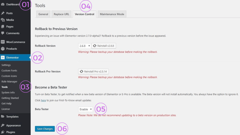
Image Credit: elementor.com
After enabling “Beta Tester”, you’ll be able to see and update to the beta version in the updates section of WordPress site.
Improved Nested Carousel for Infinite Design Possibilities
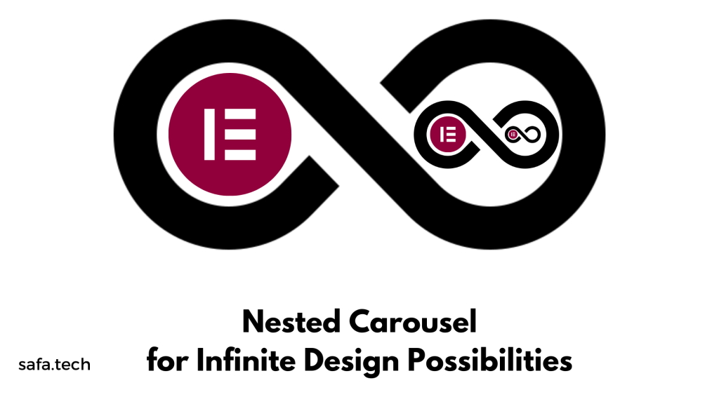
Let’s start talking about a cool new feature called the Nested Carousel in Elementor 3.14 beta. It is like a powerful and versatile tool for web design. It gives you a big space in each slide where you can put any Elementor widget you want. You can put lots of different elements inside each slide of the carousel, which means you can design your website in so many cool ways with endless possibilities to make the site look amazing.
Here are the simplified steps to test it:
- Activate the “Flexbox Container” and “Nested Elements” features in the Elementor menu in WordPress → Settings → Features.
- Create a new page and add the Carousel widget to the Editor.
- Customize the layout by adding more Carousel Items and changing options like Slides to display, Slides to scroll, and Equal Height.
- Put widgets or elements inside the slides to create the design you want.
- Explore the carousel settings, navigation, and pagination options.
- Switch to the Style tab to adjust the spacing between slides and customize the navigation and pagination using the style controls.
- Make sure everything looks and works correctly in the Editor and on the live website.
Ashley, an Elementor Expert, made it clear in his tutorial that the Nested Carousel is very flexible. He showed how anyone can easily make a carousel with pictures, text, and other Elementor widgets:
Static Item Position in the Loop Grid
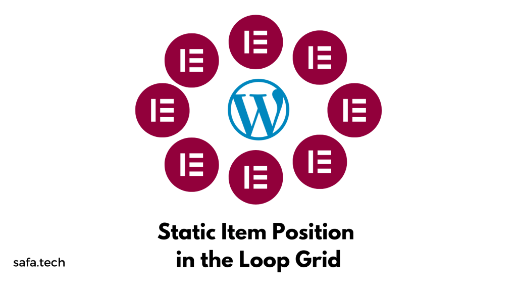
Elementor 3.14 beta has a cool new feature called “Static Item Position in the Loop Grid”. It lets you highlight important content, like events or products, right in the middle of your regular content. You can use this special feature to add something different to your usual content. It could be a picture, a form to contact someone, or a video. With the help of Ai in WordPress, especially in Elementor, the static item you choose will take the place of a regular post or product in that spot, and everything else will move accordingly.
This new feature gives you a responsive deisgn with lots of choices to customize it. You can decide where exactly the static item should be in the grid, whether it should show up just once or keep repeating at certain times, and you can even change how the layout looks by adjusting the Column Span option. It’s all about adding your own creative touch to the grids on your website.
To use the Static Item Position feature, make sure you turn on the Loop Feature in your website settings. You can find it in the WordPress Dashboard under Elementor and Features. This new feature allows you to create grids that display more than just regular posts or products. You can show off anything you want on your website using this feature.
Here are simplified instructions on how to test it:
- Make sure you have at least six posts or products on your website.
- Create a new page and use Elementor to edit it.
- Drag the Loop Grid widget into the Editor.
- Choose or create a main Loop Item template under the “Choose a template” option in the widget panel.
- Activate the “Apply an alternate template” option and select an existing template or create a new one in the Theme Builder.
- Decide where you want to place the Static Item by using the “Position in grid” field.
- Turn on the “Static item position” option.
- Ensure that the alternate template doesn’t replace the post in the designated position, but instead adds new content between the posts based on the grid position you chose.
- Adjust the layout of the alternate template by changing the Column Span option.
- Check how pagination is affected when the Static Item Position is enabled.
- Make sure everything looks and works correctly both in the Editor and on the Frontend of your website.
New Global Styles Preview
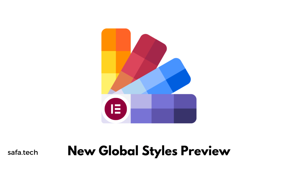
We know that global styles are like the building blocks of your website’s design. They make sure that colors and fonts look the same all over your site. Now, there’s a cool new thing that takes it even further. It’s called “Global Styles Preview” that lets you see a real-time preview of your global styles.
Initially we use to choose colors and fonts that applied to the whole site. But now, we can actually see what those colors and fonts look like in action. With Global Styles Preview, your website’s design comes alive, and you can understand how your colors and fonts fit together.
When you turn on Global Styles Preview in your Site Settings, your whole page shows a special preview of your design. It’s like a picture that shows your colors and fonts on a webpage. And when you make changes to your global styles, the preview automatically updates to show you the new design right away.
The Global Styles Preview is already on for Elementor Hosted websites, and you can turn it on for Plugin websites too.
Here are simplified steps to test the “Global Style Guide” feature in Elementor:
- Activate the “Global Style Guide” feature:
- Go to the Elementor menu in WordPress.
- Click on Elementor and then Settings.
- Look for the Features option and make sure it’s enabled.
- Save the settings.
- Create a new page and start designing it.
- Access the Site Settings panel:
- Use the keyboard shortcut Ctrl/Cmd+k.
- Check the Global Colors section:
- Make sure the Style Guide Preview is turned on by default.
- Look at the preview screen to see if the system and custom colors are displayed correctly.
- Adjust and create global colors:
- Change the color of existing global colors or create new ones.
- Confirm that the colors are added or modified in the preview.
- Test color deletion and duplication:
- Try deleting or duplicating a color and see if it behaves as expected.
- Check the color picker:
- Click on one of the colors in the preview.
- Make sure the color picker modal opens and displays the correct color on the Global Colors panel.
- Repeat the above steps for the Global Fonts section.
- Disable the Style Guide Preview:
- Switch to the content area to ensure everything is working correctly.
- Verify functionality:
- Ensure that all changes made in the Global Colors/Fonts panel and Preview are functioning as expected.
Improved UI & UX for all
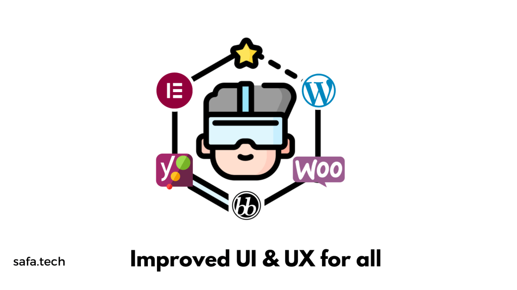
A big improvement is that now you can add things to your page with just one click. Before, you had to drag them to the right spot, but now it’s easier. When you click on a thing in the panel, it goes right where you want it to go. This makes designing a page faster and smoother because you don’t have to move things around as much. Just make sure you choose the right spot before clicking, so the new thing goes in the right place.
Visual Indication of Page or Site Parts
Elementor 3.14 Beta has a new feature that makes it easier to switch between different parts of a page. It shows a see-through overlay when you hover over headers, footers, or loop items. Before, you had to click on a specific spot to switch between these parts, but now you can click anywhere on the overlay to edit that part. This is really helpful when you’re designing pages with different sections, so you don’t have to be super precise with your clicks.
Ways to make the Top Bar better
Elementor 3.14 Beta has a new and improved Top Bar that makes it easier to do things in Elementor. The Top Bar was first added in Elementor 3.12 and now it has even more cool stuff. One of the new features is that you can add a new page right from the Top Bar, so you don’t have to keep going back and forth between the Editor and the WordPress Dashboard. There’s also a button called “Exit to WordPress” that takes you back to where you were working on the website.
Elementor has added three new features to the Top Bar. To use these features, you can turn on an Experiment by following these steps:
- Go to the WordPress Dashboard.
- Click on Elementor.
- Choose Features.
- Look for Editor Top Bar.
- Enable this.
Once you’ve enabled it, you’ll be able to enjoy the new capabilities in the Top Bar of Elementor.
Extra features for WooCommerce and WordPress
Another helpful improvement is that Elementor now includes extra features for WooCommerce and WordPress right inside the Elementor interface. If you have a WooCommerce website, you can easily set up your shop page in Elementor’s Site Settings. This means you don’t have to keep switching between Elementor and the WordPress Dashboard. Plus, you can now enable or disable comments on a page or post directly from the Elementor Page Settings with a simple toggle. These updates make managing your online store and website settings much more convenient within Elementor itself.
New Shortcuts
To get your work done quicker than ever, Elementor 3.14 Beta introduces new keyboard shortcuts.
For Mac users, shortcut for:
“Page Settings” panel = CMD + SHIFT + Y
“User Preferences” panel = CMD + SHIFT + U.
For PC users,
“Page Settings” panel = CTRL + SHIFT + Y
“User Preferences” panel = CTRL + SHIFT + U
Enhanced Performance and Accessibility: Making Your Website Better
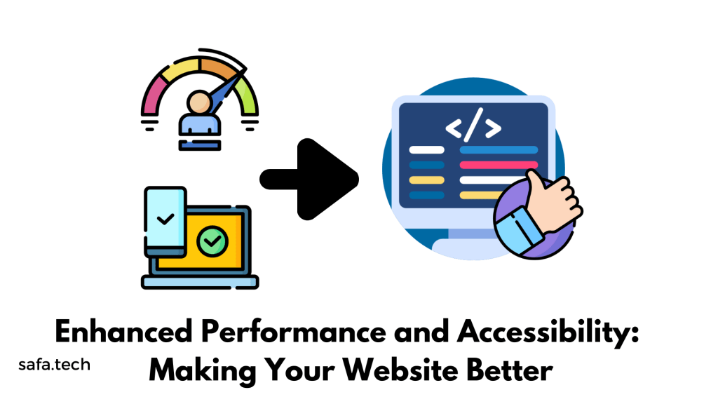
The newest update, Elementor 3.14 Beta has the power to increase performance & accessibility of a website. Like, It can make a website faster and easier to use. The Button, Accordion, and Toggle widgets, as well as the Video Playlist widget, have been improved to work better and follow the rules set by experts.
The Button widget has conditional ROLE attributes this time, while the Accordion and Toggle widgets meet all W3C guidelines. The Video Playlist widget now loads images in lazy load way, making the website load faster and helping it appear in search engines.
Updated Ways to Make Your Designs Shine
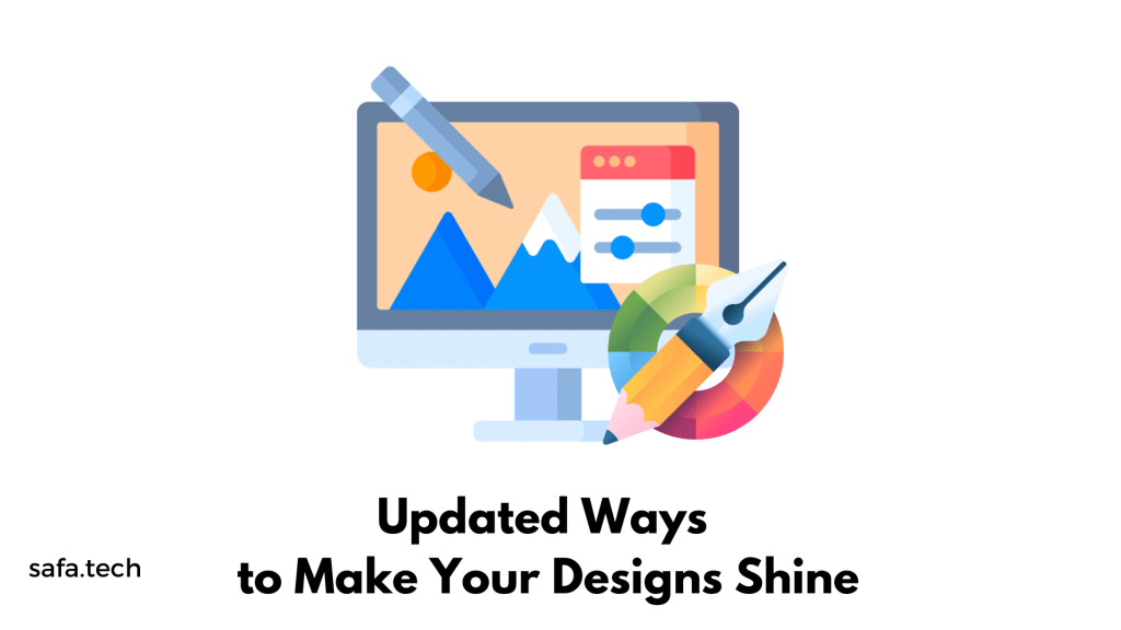
Updates to Tabs Widget: Users now can switch to the Accordion layout by using a toggle for the mobile modem that is included at the Tabs widget. This helps control how the tabs look on different devices. Additionally, the Tabs widget now allows horizontal scrolling, which makes it easier to navigate through the tabs.
In this update, they added two new features to the Additional Options section in the Content tab of the Editing panel:
- Breakpoint: Now you can choose the option ‘None’ to keep the Tabs structure consistent across all screen sizes. Previously, Tabs would switch to an Accordion layout at a certain screen size. Many users requested this change for the Tabs widget.
- Horizontal Scrolling: With this feature enabled, all Tabs will be in a single row. If the Tabs don’t fit on the screen, website visitors can scroll through them horizontally. It’s important to note that there won’t be any visual indication telling users they can scroll sideways.
These updates make it easier to control the appearance and behavior of Tabs on your website.
Changes to Icon Widget: The Icon widget has been improved. It now has a ‘Fit to Size’ option, which is great for custom SVG icons. This option removes any extra space around the icons, making sure they fit perfectly in your design.
New Divider in Menu Widget: The Menu widget now has a stylish divider that can be added between menu items. You can choose from different styles like solid, double, dotted, or dashed lines. This adds a nice touch to your menu design.
Enhancements to Image Widget: The Image widget has a cool new feature called ‘Object Position’. This lets you customize the position of your images, giving you more flexibility in how they appear in your design.
Better Call to Action Widget: The Call to Action widget has been updated to match the styling options of the Button widget. Now, you can adjust things like button padding, box-shadow, and text-shadow to make your call to action stand out.
Improvements to Gallery Widget: The Gallery widget now allows you to set individual lightbox settings for each gallery. This means you can override the default settings for a specific gallery if you want. It gives you more control over how your galleries is displayed.
Final Thoughts
That’s all the exciting new stuff in the Elementor 3.14 beta version! Thus we can say a lot of great things coming our way which makes it more worthy then ever! The Elementor team is working hard to make building websites even better. These updates give us new ways to design and make our work easier. You can try out these new features and let the Elementor team know what you think. Your feedback is important and helps them make Elementor even better for everyone. Enjoy exploring Elementor 3.14 Beta!
 safa.tech.blog
Leave a reply to sahadatishan Cancel reply